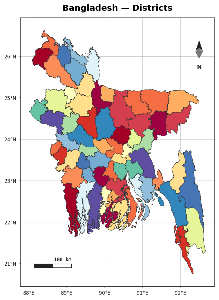
Styled maps
plot() turns a GeoDataFrame into a publication-ready figure in one call — with a north arrow,
scale bar, graticule, legend and optional region highlighting, all on by default.
import acadgis as agis

gdf = agis.load_boundaries("Bangladesh", "district")
agis.plot(gdf, palette="spectral", title="Bangladesh — Districts")
Palettes
Twelve built-in palettes cover qualitative and sequential needs:
See the available names in agis.palettes.
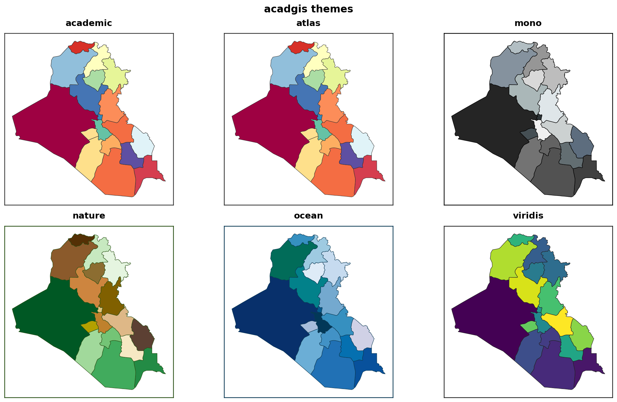
Themes
Six themes restyle the whole figure — fonts, background, decorations:
Highlighting a region
Returning the axes
plot() returns the matplotlib Axes, so you can keep drawing — add
points, rivers or custom annotations:
ax = agis.plot(gdf, highlight="Dhaka")
agis.points(ax, survey_df, value="value", legend=True)
agis.show()
Decorations
Every decoration accepts a bool, a style name, or a dict for full control:
agis.plot(
    gdf,
    north_arrow={"style": "rose", "size": 0.13, "loc": (0.9, 0.85)},
    scale_bar={"style": "stepped", "length_km": 100},
    border={"style": "checker"},
    graticule=True,
    legend=True,
)
See Decorations for every style.